
Stand in the middle of a well-lit gallery and look up. If you squint, or if a ceiling fixture leaves a bright afterimage when you look away, the lighting has already failed - not the art, not the curation, not the paint on the wall. The most common complaint from visitors is not that a room is too dark. It is that the light feels "uncomfortable" in a way they cannot quite name. That discomfort has a name in lighting science, and it is measurable.
The Discomfort You Cannot Point To
Glare in a gallery rarely announces itself as a blinding flash. It accumulates. A visitor moves from a brightly lit feature wall to a darker circulation zone, and their pupils adjust, and adjust again, and after twenty minutes the eyes feel heavy. This is not a minor inconvenience. In a space where the entire purpose is sustained visual attention to detail, eye fatigue shortens the viewing time and flattens the perceived contrast of the very textures the lighting was installed to reveal.
The metric that captures this is Unified Glare Rating (UGR) . It quantifies the discomfort caused by luminance contrast between a luminaire and its background across a defined observer grid. EN 12464-1:2021 sets UGR ≤ 19 for general gallery circulation, but conservation-grade exhibition zones target UGR < 16, and immersive black-box galleries push the threshold down to UGR < 10. Some high-performance downlights designed for galleries achieve UGR < 5 - a level of glare control that is effectively imperceptible under normal viewing conditions.
| Glare Level (UGR) | Visual Comfort Category | Typical Gallery Application |
|---|---|---|
| < 5 | Exceptional / imperceptible | High-precision galleries, close-viewing of textured works |
| < 10 | Super comfort | Immersive dark-box exhibitions, photography displays |
| < 16 | Conservation-grade comfort | Feature walls, sculpture, sensitive works |
| ≤ 19 | Standard gallery compliance | General circulation, transition zones |
| > 19 | Not recommended for galleries | - |
UGR thresholds compiled from EN 12464-1:2021 and conservation lighting guidance
The practical test is simple: stand where a visitor would stand, look toward the artwork, and then glance at the ceiling fixture. If the fixture's brightness dominates your visual field, or if the light source itself is visible as a hard point of brightness rather than a controlled pool of illumination, the UGR is too high for the space.

Why "Bright Enough" Is the Wrong Question
Gallery lighting decisions often start with lux - how much light lands on the object. Conservation science has established careful illuminance ceilings: 50 lux for high-sensitivity materials like silk and fugitive dyes, 150–200 lux for oil paintings, and 300 lux for stone and metal. These limits are non-negotiable for preservation.
But illuminance alone does not determine whether a gallery is visually comfortable. Luminance distribution - the ratio of brightness between the artwork, the immediate surround, and the background - determines whether the eye can adapt smoothly as it moves across the room. The CIE recommends maintaining gallery background brightness at one-third to one-fifth of the artwork's surface brightness. When surface luminance ratios exceed 10:1, localized glare appears in highlights while shadow areas collapse into darkness, and the visual system struggles to interpret both ends of the scale at once.
A downlight that delivers the correct lux on the painting but leaves the surrounding wall or ceiling excessively bright or excessively dark has solved the preservation problem and created a perception problem. The anti-glare specification is not an aesthetic refinement. It is the mechanism that keeps the luminance ratio within the range the human visual system can process without strain.
The Downlight Geometry That Makes Low UGR Possible
Achieving UGR values below the EN 12464-1 threshold requires more than a diffuser. The optical architecture matters. Deep-recessed housings physically hide the light source from viewing angles above a certain cutoff - commonly 30° or more - so the bright emitting surface is not directly visible to a standing visitor. Reflector geometry shapes the beam so that light is directed toward the artwork, not spilled across the ceiling plane. Microstructured lens optics or honeycomb anti-glare elements further soften the transition between the bright and dark zones of the beam pattern.
| Anti-Glare Mechanism | How It Reduces UGR | Practical Effect in a Gallery |
|---|---|---|
| Deep recessed housing | Increases shielding angle, hides source from view | Visitor does not see the bright chip directly |
| Reflector optic | Directs light downward, limits ceiling spill | Background luminance stays controlled |
| Microstructured lens | Diffuses beam edges, smooths luminance gradient | No hard "hot spot" at beam periphery |
| Honeycomb / louvre | Cuts high-angle glare rays | Softer transition between light and shadow |
Mechanism mapping based on anti-glare downlight design principles for museum and gallery applications
These are not interchangeable cosmetic features. A deep-recessed downlight with a well-designed reflector can achieve UGR < 19 while maintaining the beam intensity needed for accent lighting. A shallow fixture with the same lumen output may meet the lux target while exceeding the glare threshold - delivering the light, but losing the comfort.
Color and Angle: The Two Variables That Determine Whether the Work Reads Correctly
Two additional parameters interact with glare control to determine the final visual outcome.
Color rendering, first. A CRI of 90 is the entry point for galleries with color-critical works, but CRI alone is insufficient. The general CRI is calculated from eight low-saturation samples and does not adequately describe how a source renders highly saturated reds, deep blues, or metallic sheens - the exact colors that dominate oil paintings, textiles, and sculpture. Conservation lighting guidance increasingly references TM-30 metrics: an Rf (fidelity) ≥ 90 with Rg (saturation) around 100 ± 5 reproduces the color gradations of paintings and textiles most faithfully, while an Rg significantly above 100 produces unnatural oversaturation and below 100 produces dull, grayish tones.
Incident angle, second. For oil paintings, light striking the surface at approximately 45° minimizes specular reflection from the varnish layer entering the viewer's field of view while preserving the legibility of brushstroke texture and impasto shadow. A downlight that cannot be adjusted in angle or tilted toward the wall is not a flexible gallery tool; it is a fixed installation that either works for one hanging arrangement or compromises the viewing experience for every subsequent exhibition.
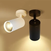
The Benwei anti-glare downlight for art galleries is built around this intersection. It delivers 140 lm/W from a range of wattages (5W–30W) in an aluminum housing, with a shielded optic designed to keep the light source out of direct view and the beam directed at the vertical plane where the art lives. The specification conversation that matters is not the wattage. It is whether the fixture's UGR behavior, beam control, and color output are matched to the sensitivity class of the collection and the geometry of the room.
What a Gallery Specification Should Ask For
The question that opened this article - whether the lighting is a tool for seeing or a source of fatigue - is answered by the numbers on the glare and luminance side of the specification, not the lumen side. A gallery downlight should be evaluated on UGR at the observer position, not merely on its brightness. It should be assessed on luminance uniformity across the vertical viewing plane, not only on the center-beam lux. And it should be chosen for its ability to hold color fidelity in the saturated regions where pigments actually live.
If you are planning or retrofitting a gallery, send us the room dimensions, the mounting height, and the sensitivity class of your typical collection. Our team will return a layout with calculated UGR values, luminance ratios across the viewing plane, and a beam-angle recommendation for the hanging heights you are working with. The right fixture is not the one that produces the most light. It is the one that lets the eye rest - and the work speak.