
Do 5000K Bulbs Look Blue? A Complete Guide to Color Perception and Room-by-Room Selection
You anticipated a clean, bright kitchen when you purchased "daylight" bulbs. What you received was a bluish, icy glare that gave the place a hospital-like atmosphere. The complaint is widespread. The bulb is too blue, while the packaging states 5000K. You must comprehend what is truly going on before you rip them out. Light at 5000K is not blue. It is a white that is neutral. Your brain, your prior lighting, and the arrangement of the space all contribute to the blue tint you perceive. This article helps you determine where $5,000,000 should go in your house or project and explains why.
The Unbiased Truth: 5000K Is Not Blue
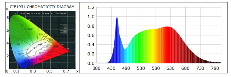
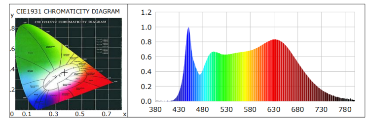
The spectrum should come first. All visible wavelengths of light are produced by a typical 5000K LED. The curve passes through green, yellow, and red in addition to having a peak in the blue area. The colour is full-spectrum white. The 5000K coordinate is located on the white locus, close to the center of a chromaticity diagram. It is the same colour as the D50 standard, which is utilised in printing and design projects where colour is crucial. Physically, the light is a well-balanced white that resembles daylight.
What makes it feel blue, then?
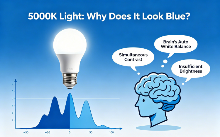
Three Perceptual Effects of Why Your Eyes Say Blue
Unlike a spectrometer, your visual system does not measure light. It provides interpretation. A neutral white is transformed into something chilly by the combination of three effects.
The automatic white balance of your brain. Natural daylight ranges from 5000K to 6500K during the day. This is considered "neutral" by your brain. Your house is lighted by 2700K or 3000K lamps at night. That warm glow becomes the new neutral as your brain adjusts. Your brain recognises the difference and identifies a 5000K light as blue when it arrives in that heated atmosphere. There was no shift in the illumination. The citation did.
Concurrent contrast. The disparity is enhanced when two distinct colour temperatures are visible simultaneously. In a kitchen with 2700K ceiling lights, a 5000K under-cabinet light will appear significantly bluer than it is. It appears white on its own. It appears harsh when placed next to warm light.
Not bright enough. The Kruithof curve illustrates the connection between subjective comfort and colour temperature. To feel realistic, high colour temperatures require high illumination levels. In a dark room, a 5000K lightbulb appears dismal and blue. That same bulb feels crisp and clean at 300 lux or more. The reason so many daylight bulbs fail is because the majority of residential spaces are illuminated much below that threshold.
Where to Use and Where Not to Use 5000K
You can accurately arrange 5000K if you are aware of the perceptual pitfalls. The simple guideline is to avoid it when the goal is relaxation and to utilise it when visual clarity is important.
Kitchens, baths, laundry rooms, garages, home offices, and workshops are among the best locations for 5000K. These areas are focused on tasks. 5000K makes it easy to read labels and see the true colour of ingredients in a kitchen. It displays precise skin tones for grooming in a bathroom. It offers the crisp, detailed visibility required for safe work in a garage or workshop.
Areas to stay away from. Living rooms and bedrooms are places to unwind. The warm, dark environment that tells your brain to get ready for sleep is suppressed by 5000K. Food appears unappealing in dining rooms due to the chilly lighting. Stick to 2700K or 3000K for these rooms.
Combining different colour temperatures. It is not necessary to utilise a single colour temperature in a single room. Using 2700K or 3000K for ambient overhead lighting and adding 5000K task lighting only when necessary is a popular design strategy. For instance, you can put 5000K LED strips beneath cupboards and maintain warm ceiling lighting in a kitchen. The cold task light gives you accuracy when you chop and cook, while the warm ambient light makes the space welcoming.
How to Purchase 5,000K Without Looking Blue
Keep an eye on the colour rendering index and luminous flux if you want to completely avoid the blue tint.
90 or above is a high CRI. Low-cost 5000K LEDs frequently feature little red and cyan content and a bright blue peak. This uneven spectrum has a chilly, antiseptic appearance. The gaps are filled in by a high-CRI LED, which balances the blue with rich reds and teals. Instead of a harsh blue, the outcome appears to you as a clear, pure white. Demand CRI 90+ for any living area. CRI 80+ may be sufficient for a garage or workshop, but higher is generally preferable.
Sufficient lumens for the area. According to the Kruithof curve, 5000K requires adequate illumination. Aim for a minimum of 300 lux on the task surface as a practical guideline. That equates to about 3000 lumens overall from all sources in a 100-square-foot kitchen. That level will never be reached with a single 800-lumen bulb in a large space, and the light will always appear blue and dim. To get the desired brightness, use numerous fixtures or bulbs with higher output.
4000K is a reliable backup if you're still not sure. Warm white and cool white are directly separated by 4000K. It offers a clear, alert light that is much less prone to cause the "too blue" criticism. 4000K is a dependable halfway ground if you desire the utility of a lower colour temperature without the risk.
Spectrum of 4000K
Spectrum of 5000K
Conclusion
5000K is an instrument. When you fit it to the task, give it appropriate brightness, and select a high-quality spectrum, it works. It's not the light itself that has the blue tinge you detest. It indicates that the light is being used against the incorrect background, at the incorrect brightness, or at the incorrect location. Choose the ideal space, achieve 300 lux, and purchase a high CRI. The outcome is a clear, natural white that gives your room a clean, practical sense rather than a chilly one.
related Products
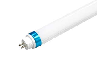
5000K T6

5000K Panel Light
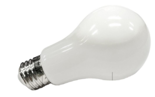
5000K Bulb

5000K Downlight
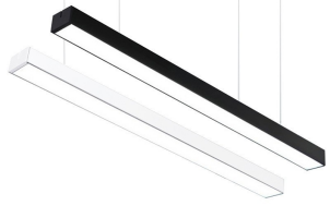
5000K Linear Light
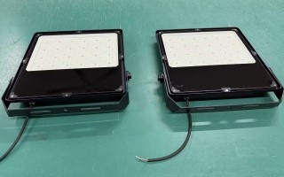
5000K Floodlight
FAQ
Q: For a kitchen, is 5000K too blue?
A: No, as long as the kitchen has adequate lighting. The countertops should have at least 300 lux. Use high-output lights or several fixtures. When there is enough light, 5000K looks neutral and clean, which makes it simpler to read labels and perceive food colours.
Q: Does 5000K appear less blue with a higher CRI?
A: Indeed. The spectrum of a high-CRI 5000K LED is more uniform, with more red and cyan energy and less blue spike. A clean, genuine white is the result of this harmonised spectrum. Because of their spectrum's blue slant, low-CRI bulbs can appear frigid.
Q: Is it possible to use 5000K in a bedroom?
A: It is not advised. Bedrooms are places to unwind and get ready for sleep. In the evening, 5000K light may disrupt your circadian rhythm and seem harsh. Instead, choose 2700K or 3000K.
Q: Which is preferable for a home office, 5000K or 4000K?
A: Both are effective. Some people like the highest contrast and alertness at 5000K when working during the day. If you utilise the office at night or are sensitive to cool light, 4000K is a safer option. 5000K is a good option for a dedicated workspace during the day. 4000K is more adaptable for a multipurpose space.