Do 5000K Bulbs Really Give Off a Blue Hue?
Are you choosing lighting for your home, studio, or office? Have you been attracted by labels like "daylight" or "5000K," but worry they might emit a cold blue tint? Perhaps you've browsed various LED bulbs on e‑commerce sites and imagined the ideal lighting environment in your mind. Don't worry – the question you have is actually shared by many professional lighting designers and users. This article will help you understand color temperature, color rendering index (CRI), and the science behind blue light, so you can make an informed lighting decision.
1. From a Spectroscopic Perspective: 5000K Itself Is Not "Blue"
From a technical standpoint, the chromaticity point of a 5000K light source lies in the white region of the CIE chromaticity diagram – in fact, it has a slight yellowish tendency. The spectral power distribution (SPD) shows that a high‑quality, full‑spectrum 5000K LED (such as the D50 standard illuminant) exhibits a very flat, balanced spectral output across the visible wavelength range, with well‑proportioned color components rather than a dominance of blue light. The basic principle of white LEDs is: the blue chip emits blue light (around 450nm), which partly excites yellow‑green phosphor (around 570nm), and the two mix to produce white light. A full‑spectrum 5000K LED further adds violet, cyan, short‑wave green, and long‑wave red to make the spectrum more complete and uniform. Therefore, from a purely technical viewpoint, a well‑designed 5000K light source does not give off a harsh blue hue.


2. Why Can 5000K Sometimes Look Blue? – The Eye's Automatic White Balance
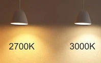
However, objective measurement is one thing; human perception is another. Our visual system constantly performs automatic "white balance" based on the ambient light. When you turn on a 5000K lamp in your home lit with 3000K warm light in the evening, your visual system hasn't yet adjusted from the warm‑biased calibration – so the 5000K light will appear cool or even slightly blue. A 5000K bulb does look relatively blue when placed next to or compared with a lower‑color‑temperature source. This "bluish" feeling is relative: if you are used to 2700K–3000K warm light in residential settings, seeing 5000K for the first time will naturally feel "blue"; but if you have just come indoors from outdoor noon sunlight (about 5500K–6500K), 5000K will feel very comfortable and natural.
3. Blue Light Content and Circadian Impact of 5000K – An Important Health Consideration
Since 5000K is not "blue" on the chromaticity diagram, does it emit a lot of blue light? The answer is: it does emit more blue than lower color temperatures, but significantly less than very high color temperatures like 6500K and above. 5000K sits in the "mid‑to‑high" range of the color temperature spectrum, while 4000K–5000K is considered neutral white. Noon sunlight is about 5500K–6500K and contains abundant short‑wave blue light, helping to maintain daytime alertness and suppress melatonin secretion.
| Color Temperature Range | Light Appearance | Relative Blue Light Content | Effect on Circadian Rhythm |
|---|---|---|---|
| 2700K–3000K | Warm yellow, cozy & relaxing | Low | Safe for nighttime use, less sleep disruption |
| 3500K–4100K | Neutral white, natural & comfortable | Medium‑low | Balanced daytime, avoid too late in evening |
| 5000K–5700K | Cool white, bright & crisp | Medium‑high | Good for daytime alertness, may affect sleep if used at night |
| 6500K+ | Blue‑white, cool & stark | High | Strongly suppresses melatonin, not recommended for general indoor use |
So, does a 5000K bulb give off a blue hue? The answer depends on your reference and application. Technically, a high‑quality 5000K source is not "blue." Subjectively, compared to the warm lights you're used to, it can feel "cool." Physiologically, its blue light content is enough to affect your circadian rhythm in the evening. Studies show that a tunable white LED at 5700K can suppress melatonin by about 10%, while at 2100K the suppression drops to only 0.1%. If you need lighting at night, we recommend using warm‑white auxiliary lighting.
4. Comparison: 5000K vs. 4000K – How to Choose?
The main difference between a good 5000K and a 4000K source is: 4000K appears neutral white, soft and stable – suitable for everyday environments where you need both relaxation and focus. 5000K is brighter, crisper, and cooler – simulating daylight, ideal for tasks requiring high alertness and accurate color perception. In terms of Color Rendering Index (CRI) – which measures how faithfully a light source reveals the true colors of objects (with a reference source having CRI = 100, higher values mean better color rendering) – a high‑CRI (Ra ≥ 90) 5000K bulb can reproduce colors very accurately. Light below 4000K is warm and relaxing; 4000K–6000K is neutral and comfortable.
| Comparison Item | 5000K Daylight | 4000K Neutral White |
|---|---|---|
| Light Appearance | Bright, fresh, near noon daylight | Soft, natural, neither cold nor warm |
| Blue Light Content | Medium‑high, best for daytime | Medium‑low, suitable for long indoor use |
| Recommended CRI | Ra ≥ 90 (for color‑critical tasks) | Ra ≥ 80 (sufficient for daily use) |
| Best Applications | Color matching, drafting, photography studios, kitchen workspaces, garages, high‑focus work areas | Offices, studies, living rooms, classrooms, commercial displays |
| Suitable for Bedroom? | Not recommended | OK with warm white assistance |
| Visual Comparison | Looks bluish when paired with lower CCT | Neutral, less likely to appear tinted |
5. Advantages of Full‑Spectrum 5000K & Buying Recommendations
A truly high‑quality 5000K LED is not just a simple cool white – it is "full‑spectrum." A full‑spectrum LED should closely mimic the 5000K solar spectrum. Its continuous, complete spectral distribution not only provides high color rendering but also delivers daylight‑like light quality during the day, enhancing visual comfort. Buying tips:
- Prioritize products with Ra ≥ 90 (for color‑sensitive scenes, look for Ra ≥ 95).
- Know your application: high‑focus daytime tasks → 5000K; relaxing evening or general ambient lighting → 4000K or lower.
- Check spectral continuity – review the product datasheet or third‑party test reports.
Recommended color temperatures by room:
- Kitchen work areas: 5000K – bright and uniform for safe cooking.
- Living rooms / bedrooms: 2700K–4000K – warm and relaxing.
- Offices / studies: 4000K–5000K – focused but not fatiguing.
- Bathroom vanity: 4000K–5000K – accurate makeup/color judgment.
- Art studios / photography: 5000K (Ra ≥ 95 recommended) – true color reproduction.
- Garages / basements: 5000K – enhances spaciousness.

6. Summary
Objective answer: A 5000K bulb's chromaticity is not blue – it lies in the white region with a slight yellowish tendency. A high‑quality full‑spectrum design has a balanced SPD, not dominated by blue.
But keep in mind: When compared with lower‑CCT lights, it can look relatively blue; its blue light content is sufficient to affect sleep rhythms if used at night.
So, if you need high concentration and accurate color perception during the day – such as in kitchen cooking, office work, painting, or photography – a high‑CRI 5000K full‑spectrum bulb will give you daylight‑like clarity. But in bedrooms or nighttime areas, use it with caution – choose 4000K or warmer as your primary lighting. The industry consensus is: Cool‑white LEDs (5000K and above) have higher blue light content, making them more likely to suppress melatonin and increase visual load at night.
📋 Buying Checklist
☐ Confirm your application: daytime focus zone (choose 5000K) or evening relaxation zone (choose 2700K–4000K)
☐ Check CRI value: daily lighting ≥ 80, color‑critical tasks ≥ 90
☐ Look for spectral graphs: prefer "full‑spectrum" or spectrally continuous products
☐ For nighttime use: use tunable white or auxiliary warm lighting
We hope this professional analysis helps you find the perfect light – from warm and tranquil to bright and crisp. Choosing the right color temperature gives any space its true soul.